Your Custom Text Here
Flight!
An interactive application to display which is the best airline to fly with when flying domestically in the United States.

Team
James, Won, Leo
Duration
4 weeks (class project)
ToolS
Kaggle's Dataset, HTML&CSS, Javascript, React, and Firebase
MY Role
HTML&CSS and react framework, navigation bar, interactive bar chart, web responsive design, and styling
Final Product
Interactive Features
We started creating the framework of this app in HTML&CSS. We used static images as placeholders for the three interactive features. We then created three interactive features: airline delay time bar chart, airline information table and US airports map using javascript and open source libraries.
Before
After


Feature Breakdown
Feature One: Airline Delay Bar Chart
The airline delay chart displays the top 14 US airline’s average delay time. We used an open source library called Rechart to construct the interactive bar chart. Users can adjust the range of the airlines using the bar below.
We also considered making the interactive bar chart mobile friendly and responsive.


Feature Two: Airline Information Table
This table displays the top 14 US airline data including origin airport, destination airport, and departure delay and allows users to highlight their preferred airline.
To highlight user’s preferred airline, we learned that we could save user’s preferred airline as a state variable and used if/else statement to manipulate the row background.


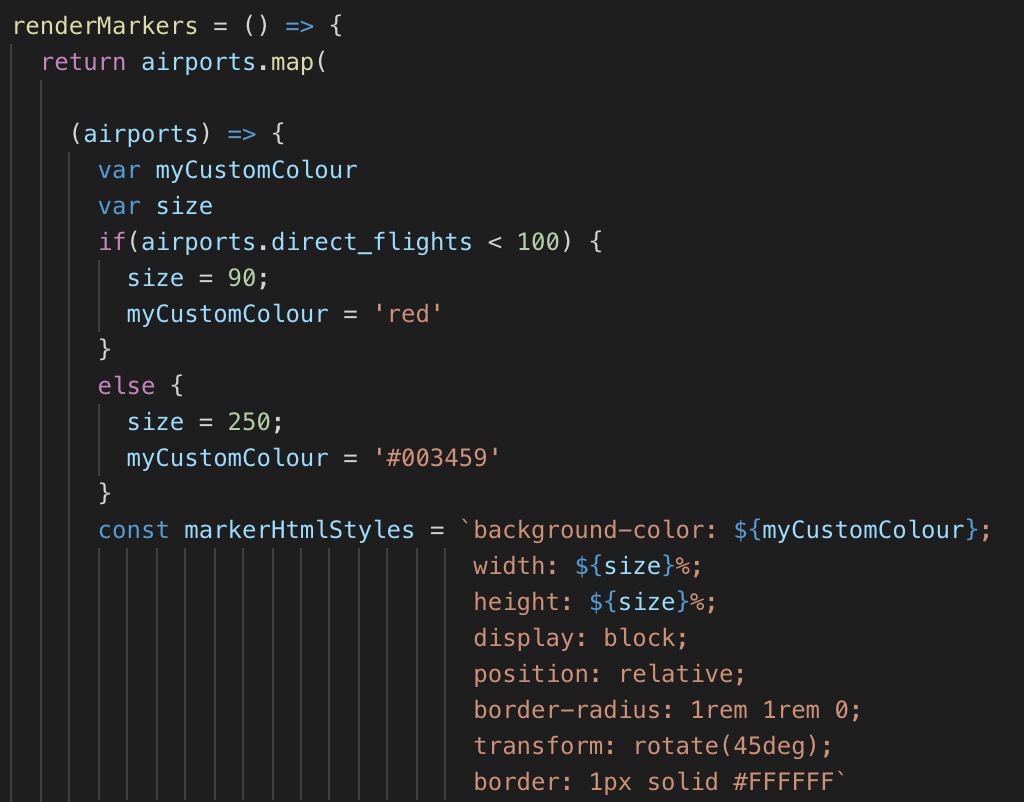
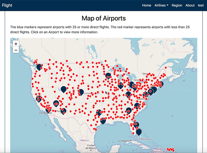
Feature Three: Interactive Region Map
Lastly, we created an interactive map using Leaflet and OpenStreetMap. It displays airports data in the US and their direct flight information.
The size of the airport markers is determined by the amount of direct flights per day. Because the direct flight varies from 1 (smallest) to 253 (largest), we increase readability by using blue and red markers to differentiate the airports.